Stone Lithography: Part Two
- Jasdip Singh Dhillon

- Sep 29, 2019
- 4 min read
Updated: May 24, 2020
In November 2017, I had the pleasure of attending a course on Stone lithography (ਪੱਥਰ ਛਾਪ) at Citylit College, taught by professional lithography artist Simon Burder (see @StoneLithoSimon on twitter) This course was funded by an ICON Professional Development Bursary as part of a wider project on Gurmukhi lithographic books and their conservation. We are often asked to repair and conserved lithographed Gurmukhi Pothi Sahibs so I was keen to gain a better understanding of the art of lithography. The first part of this blog series (read here) covered the method of producing prints by drawing designs directly onto the stone. This second instalment will discuss the method of transfer lithography as used widely in South Asia.
In direct lithography, the artist or scribe had to draw a design in reverse on specially prepared lithography stone so that it would produce a correct image when printed. This was fine for drawings and artworks but posed a challenge for printers who wanted to print books made up of written text. The printer would require scribes who were skilled at writing backwards. Historians of lithography have debated whether it was possible for scribes to practically achieve this. Given the high calibre of indigenous scribes, it is likely that this was possible but for practical purposes of speed and efficiency, the method of transfer lithography was more common. Transfer lithography allowed a scribe to write “normally” on a specially prepared paper which could then be transferred onto the stone. This made it very easy for Gurmukhi scribes trained in manuscript production to benefit from the new technology of lithography, I will now detail the process of transfer lithography as learnt on the course.
The first stage of transfer lithography is the preparation of transfer paper. A medium weight cartridge paper was coated with a mixture of chalk and gum arabic (ਕਿੱਕਰ ਦਾ ਗੂੰਦ) on one side in order to create barrier layer for the drawing/writing ink. It is highly probable that the technique of preparing transfer paper varied from workshop to workshop. Unfortunately, it is not known whether any examples of South Asian transfer survives in archives or museums.
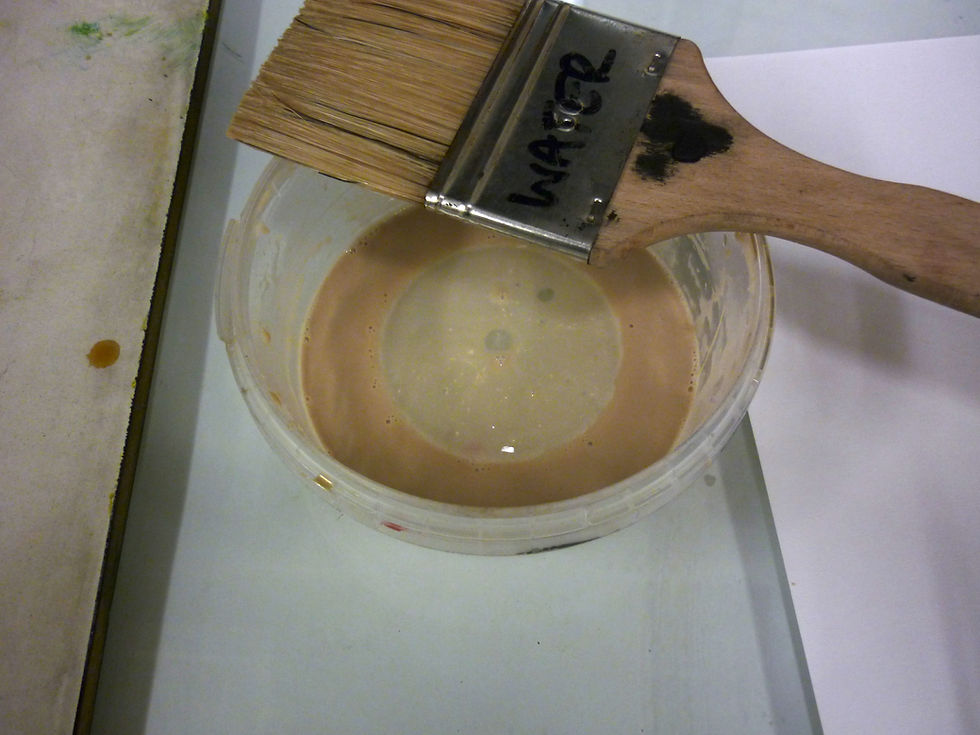
The chalk and gum arabic mixture was coated liberally onto a cartridge paper.
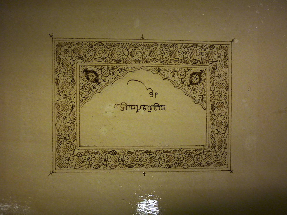
The chosen design for my transfer lithography sample was based on the decorative designs found in an 1886 lithographed Guru Granth Sahib. As with many other lithographed title-page designs, the floral motifs show a strong influence of Kashmiri artistic styles in the form of wide vine-work borders (ਵੇਲਕਾਰੀ).


The designs were based on two folios from a beautiful 1886 lithographed Guru Granth Sahib
The ink used for drawing has a soapy feel and is greasy yet water soluble. This allows it to be diluted in water to the desired consistency for drawing. Once dry, this design was transferred to the lithography stone. To do this, the transfer paper was dampened and placed face down onto the stone. The stone was passed through the lithography press and the transfer was peeled away revealing the transferred design. The design visible on the stone was now a perfect mirror-image of what I had drawn on the transfer paper.
The transferred design was given a "gum etch" ensure the edge of the design remained crisp and clear.
The transfer paper itself could only be used to make a single transfer as the ink had been almost entirely removed from the paper. All that was left was a faint outline. This posed an interesting question. Did Gurmukhi lithography workshops produce each decorated design individually from scratch or did they use templates and drawing aids to speed up the process? Finding the answer requires further research and experimentation.

The design was completely removed from the transfer paper, leaving behind only a few faint traces.
The subsequent stages revealed the challenges of the lithographic process as my neatly transferred design was to become marred by flaws in the stone. The stone was prepared for printing using the same set of processes outlined in the first blog of this series.
The design appeared crisp during the gum-etching stage but problems began to surface when the stone was inked in preparation for the first proof-prints. Strange smears and smudges began to appear in areas which were previously perfect in appearance. These smears were areas where greasy dirt had accumulated when the stone was in storage. This may have been due to occasional accidental touch of someone’s hands on the stone. Even the slightest touch from a fingertip can leave a greasy imprint which only becomes visible when the stone is inked-up for printing. The common presence of fingerprints in the margins of Gurmukhi lithographed texts now began to make perfect sense.

Flaws in the stone were revealed only during the inking-up stage of printing. These were greasy marks and smudges which attracted the printing ink.
Through the skill and guidance of the course tutor, Simon Burder, I was able to salvage most of the impression by carefully abrading away the surface of the impression where there were ink smudges. Unfortunately this also meant I had to erase away the text in the centre.

The salvaged final design.
Overall, this course taught me a great deal about the craft of lithography. Flaws and marks we encounter in real-life Pothi Sahibs now make perfect sense. One can only bow down and marvel at the care and craftsmanship involved in producing the cleanest, highest quality printed Pothi Sahibs.
If you would like to learn more about early South Asian printing please visit the links below:


Comments